Unusual Customs
An AI-native customs platform acquiring and modernising traditional brokerages.
Brand Identity
Website
Product Design
Introduction
An end-to-end design role — brand, identity, website and product — for a startup turning ageing customs brokerages into a modern, technology-led group.
Client
Unusual Customs
Role
Product Designer (Freelance)
Timeframe
Aug 2025 – ongoing
Scope
Brand Identity
Website
Product Design
Tool box
Figma Framer Illustrator Claude ChatGTP Gemini Magnific
Context
Customs clearance is a fragmented, paper-heavy industry. Most brokerages still run on manual data entry, ageing software and knowledge locked in a few experienced heads — accurate, but slow and hard to scale.
Unusual Customs acquires these established brokerages and modernises them with a shared, AI-native software stack, integrating them into one group.
I joined at the start, with only a name and an early prototype in place, and built the brand, website and product from there.


01
Brand & identity
Aug – Sep 2025
I started with research before opening Figma. I looked at how other "roll-up" platforms in adjacent verticals were positioning themselves — Dwelly Group as a closer reference, plus a wider set of customs brokerages, logistics players and AI-first B2B brands.
The goal wasn't to copy, but to understand which visual codes the audience already recognizes, and where there was room to break out.
I presented the research and several directions before any logo work — moodboards, references, tonal options. From there, I went into logo development: four rounds of iteration, with the team narrowing in and occasionally walking back earlier decisions, which is normal at this stage of a young company.


Brand & identity
Outcome
Around the logo, I built out the full identity system: logo mark, wordmark and lockups with usage rules, a typography system optimised for both marketing and product UI, a muted colour palette anchored in grays with a single warm orange, plus image direction and basic motion principles.
The styleguide became the foundation for everything that followed — website, pitch decks, product UI.
02
Website
Sep – Oct 2025
The website work started while the styleguide was still being finalised. Before opening Framer, I structured the site in FigJam — sitemap, narrative flow, page hierarchy, and the core message each section had to land.
he founding team brought the substance for the copy; I refined and tightened it during layout. The site is built around two audiences: brokerage owners considering a sale, and investors evaluating the platform. Everything else — careers, contact, legal — supports those two paths.
I went with Framer for the build — partly familiarity, partly because we expected to lean on a CMS layer for content edits. The site turned out smaller than planned, so I made changes directly in Framer off the team's comments instead.
AI in the workflow
ChatGPT for copy iteration — turning raw input into cleaner web copy
Gemini and Magnific for image generation — portraits, abstract backgrounds, hero visuals
Framer Wireframer for motion experiments
This wasn't a radical AI workflow — that came later, when I started building the product itself. For the website, AI was used quietly where it made things faster: copy, visuals, light animation exploration. The real shift in workflow happened in Phase 3.
Refinement
Because the styleguide was solid and the structure was locked early, the site went through fewer revisions than most projects of this kind. Most of the work after the initial direction was tuning — getting the motion and detailing right, so the site felt modern without feeling overdesigned.
The longer conversations were about detail — where the founding team wanted pixel-level involvement, and where we read a solution differently. Some of those calls are easier to make by looking than by arguing: build it, see it together, keep it or take it back out.
With a hands-on team that loop is normal, so I built it into the process rather than fighting it.


Website
Outcome
The site went live in October 2025. Since then, the company has acquired its first brokerage, with further deals in negotiation.
As the company moves into its next stage of growth, the website serves as its primary public surface — for seller outreach, investor conversations, and increasingly for reaching potential hires.
03
Product Design
Nov 2025 – May 2026
In November, the focus shifted from brand surface to the actual product: Flow, an AI-native customs declaration tool used internally by the brokerages in the Unusual Customs group. The first user is GB Customs Clearance, the platform's first acquisition.
Flow extracts data from invoices, packing lists and emails using AI, maps the values to the structured fields a customs declaration requires, and prepares the submission to eCustoms.
When the AI is confident, the broker reviews and submits. When fields are unclear or missing, the broker can resolve them directly against the source document inside the app. The previous workflow was fully manual — Flow turns hours of document handling into minutes of review.
Working from an existing prototype
When I joined the product, a rough prototype already existed with a three-step flow: Extract → Merge → Draft. Each declaration had to pass through all three.
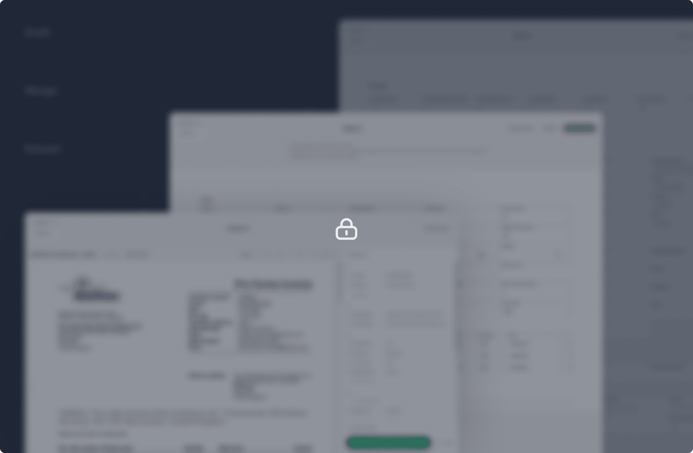
After working through the actual broker workflow, it became clear that Extract and Merge were doing the same conceptual work — pulling data and matching it to fields. I collapsed them into a single step.
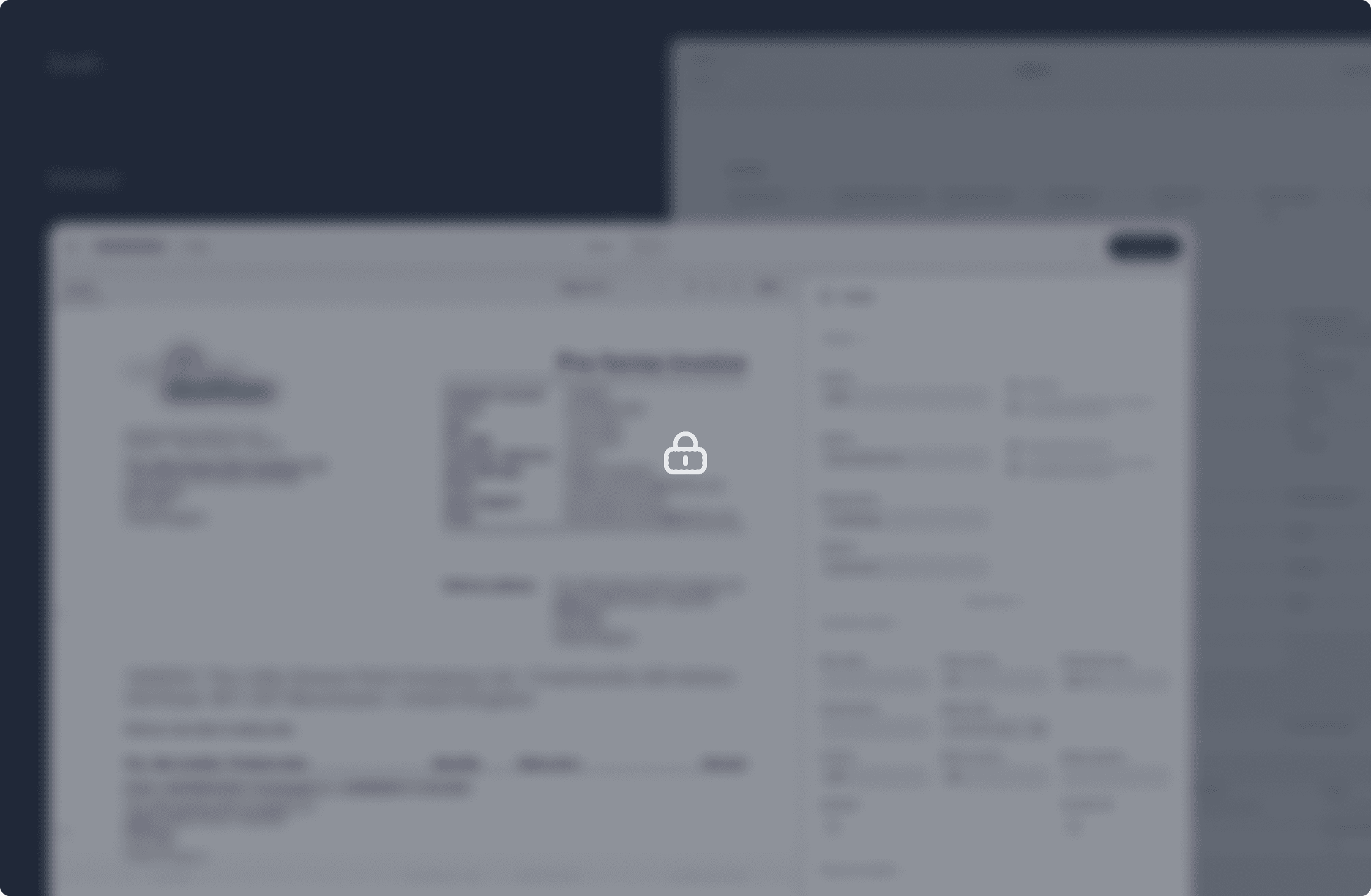
The new flow has two stages: Extract (data is pulled and mapped), and Draft (a broker confirms, then submits). One less screen, one less context-switch, same outcome.
Designing in two parallel tools
The bigger shift came in March 2026, when I started building a digital twin of the app in Claude, alongside the Figma work.
The twin isn't a full functional copy — input validation, real backend integration, error states for every edge case all stay in the engineering codebase. What the twin does is show how the UI looks, moves and behaves as a working artifact.
Buttons respond. Components animate. Flows can be clicked through. The founders and engineers can open a URL and use the design instead of reading a Figma annotation that says "on click, this transitions to…"
That changed three things in the way I work
Discussions stopped being about interpretation. People weren't reading my mockups differently anymore — they were looking at the same thing.
Documentation effort dropped sharply. I used to write long Figma annotations describing component states. Now most of that is just the twin.
I could explore directions in parallel. For new features, I'd build two or three working variants in Claude before opening Figma. Decisions got made on real artifacts, faster.
For features that already exist in the design system, I start in Figma and move components into Claude. For new features, I start in Claude — explore, decide on a direction — then formalise back in Figma. AI for exploration, Figma for precision.
I direct Claude visually rather than through code — enough HTML/CSS to read what's produced and steer precise changes.
The design system
The first version was a custom system with only the components Flow actually needed. As the app grew more complex, that became a maintenance burden.
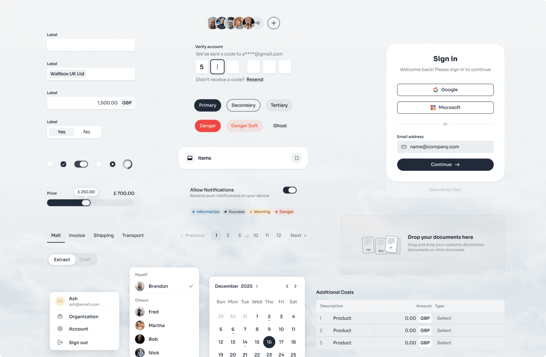
In February I migrated to HeroUI v3 — about 60 core components, with custom additions for Flow-specific patterns.
3 Features worth highlighting
Extract was the first screen built in the new system. It separates the two parts every customs declaration needs — header data and item-level data — and lets the broker reconcile each against the source document.
Dashboard was the most recent piece, and the first designed AI-first. Before opening Figma, I explored the overview, filters and document upload directly in Claude, with several variants running as working interfaces before any final call. The detail view that opens on a declaration points to a longer-term goal: skipping the intermediate steps and submitting straight from there once the AI is confident enough.
MultiDoc ties it together. A declaration usually has several supporting documents, and MultiDoc lets the broker move between them quickly while connecting errors back to their source: click a field that couldn't be auto-filled or carries a warning, and it jumps to the exact spot in the right document. The real risk in customs work is missed details — this makes them harder to miss.
Dashboard was designed AI-first, and the exploration would have taken significantly longer in Figma alone — the variants would have stayed flat, clickable but not feel-able. Working live in Claude let me test how things actually behaved before committing to a direction.
What changed for the team
Beyond my own process, the twin changed how the team worked around it. A shared, clickable reference was easier to align on than written specs — for design, management and engineering alike — and it made handover more straightforward.
The team has been adapting to several new processes at once, so it's hard to isolate the effect of any single change. What I can say: the workflow we've settled into is faster than what we had before.


Product Design
Outcome
In the nine months I've been involved, Unusual Customs has grown from an early-stage company with a name, a rough prototype and a basic structure into a live platform with a brand, a website and a working product in production use. The website is its public surface for both seller acquisition and its next stage of growth. Flow is in active use at the first acquired brokerage, with further integrations following.
For me personally, this is the project that rebuilt my own design workflow. I went from designing in Figma alone to working in two parallel tools — Figma for precision, Claude for exploration and behaviour. That shift is something I'm taking into every project that follows.
Reflection
Across this project — the brand, the website and the product — the same pattern kept showing up. Something rough and real is often more useful as a starting point than a blank canvas, because the constraints are already there. And working with a hands-on founding team means a lot of decisions get made by seeing something rather than discussing it — the faster I can make something visible, the faster decisions land.
AI didn't replace the design work here. It shortened the distance between an idea and something the team could actually react to.